
10 min read
Screenshot Backdrops and Mockups: A Practical Guide for Product Marketing
A practical screenshot mockup guide: choose the crop, canvas, backdrop and frame that make product images clearer without over-designing them.
- how-to
- screenshots
- product-marketing
KEY TAKEAWAYS
- Start with the destination's aspect ratio and the screenshot's crop. A backdrop cannot rescue an image that is framed around the wrong thing.
- Padding does more work than decoration: it separates the interface from the page, slide or feed where the mockup will appear.
- Use a window frame only when it gives useful context, and use annotations only when the image is meant to teach rather than announce.
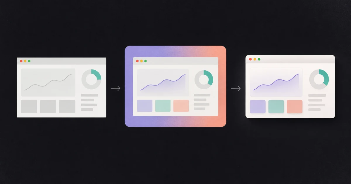
A screenshot mockup generator can make a product capture look finished in a few seconds. It can also bury the product under a loud gradient, an oversized shadow and a browser frame inside another browser frame.
The useful part is not the decoration. It is the control over crop, breathing room and context. This guide works through those decisions in the order that matters, whether the final image is for a launch post, a slide deck, a help article or a landing page.
Start with where the image will live
Do not style the screenshot at its original dimensions and decide where to use it afterwards. Pick the destination first.
| Destination | A useful starting shape | What usually matters |
|---|---|---|
| Website feature section | 16:9 or the section’s actual container | Readable interface at desktop width |
| Presentation slide | 16:9 | Space around the image and high contrast at a distance |
| Square social post | 1:1 | One clear focal point, not a complete dashboard |
| Story or vertical post | 9:16 | A tight crop and generous space above or below |
| Documentation | Original or 4:3 | Legibility and precise annotations |
These are starting points, not platform rules. The real question is how large the important part of the interface remains after the image is placed. A full dashboard squeezed into a square may be technically complete and practically unreadable.
Set the canvas shape first, then scale the screenshot within it. If the product needs to stay uncropped, reduce its size and let the backdrop take the remaining room. If one control or result is the story, crop to it.
Fix the capture before adding a backdrop
A finished mockup begins with an uneventful capture.
- Close menus, tooltips and notifications that are not part of the story.
- Put the product into a believable state. Empty tables and placeholder charts make even a polished mockup feel staged.
- Remove real names, email addresses, tokens and customer data. Blur is useful for a bug report; made-up data is usually cleaner for marketing.
- Capture only what supports the claim. If the post is about a new filter, the browser bookmarks bar and three unrelated side panels do not need to come along.
- Check the final pixel size. Scaling a small crop up later softens type and thin UI lines.
For a tall page, capture quality comes before styling. The guide to full-page screenshot failures explains repeated headers, blank lazy-loaded sections and torn seams. FramioCam’s capture modes cover visible, full-page, full-site and drawn-region captures.
Padding is the first design control
Padding is what turns a screenshot into an object on a canvas. Without it, the product UI runs into the surrounding page. Too much of it makes the interface too small to read.
A sensible first pass is to make the margin about 6–10% of the shorter canvas edge. Then judge the image at the size where it will actually appear, not zoomed to 100% in the editor.
Use even padding when the screenshot is the whole composition. Use different values on each side when something else needs room: a headline above, a watermark below, or an annotation pointing in from one edge. The asymmetry should have a job. Randomly pushing the capture off-centre just makes it look misplaced.
For a set of launch images, keep the same canvas shape, padding and screenshot scale throughout. Consistency between five images is more persuasive than making each one individually dramatic.
Choose a backdrop for contrast, not novelty
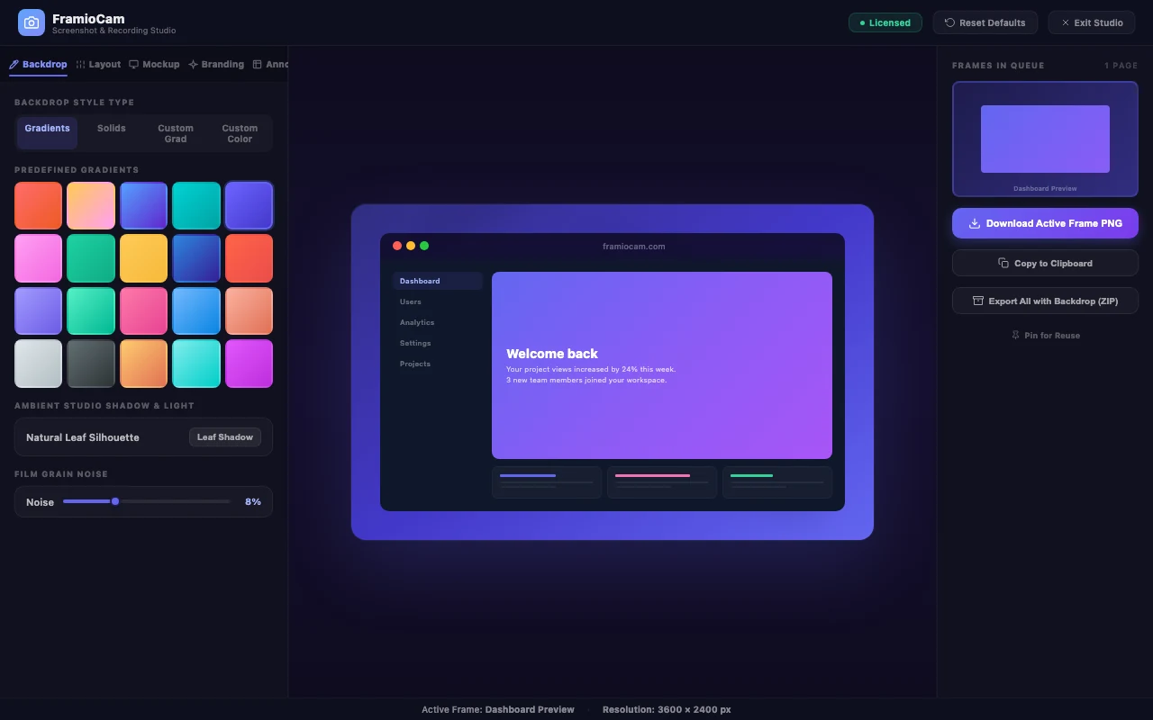
The backdrop has two jobs: separate the screenshot from its surroundings and give a set of images a recognisable visual rhythm.
Look at the outer edge of the interface. A dark application on a dark backdrop disappears unless there is a border or light behind it. A white application on a pale gradient has the same problem. Choose the backdrop against the screenshot’s edge, not against the colour of its logo.
Three reliable approaches:
- A quiet solid colour for documentation, release notes and dense interfaces. It puts the attention on the product.
- A two-colour gradient with related values for launch pages and social posts. Keep the brightest area away from the brightest edge of the screenshot.
- A restrained texture when a smooth gradient shows visible banding. Fine grain can solve a rendering problem; heavy grain becomes a new one.
Patterns and cast-light effects work best when the screenshot itself is sparse. Behind a table, chart-heavy dashboard or code editor, they compete with the same small-scale detail the reader is trying to see.
Add a window frame only when it explains something
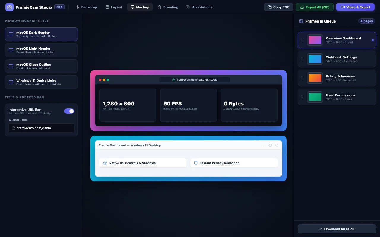
A browser or desktop window frame says, “this is a product running in a window.” That can be useful context on a landing page. It is redundant when the capture already contains browser chrome, and distracting when the audience only needs to see a single control.
Match the frame to the audience when the platform matters. A Windows-focused guide shown inside macOS chrome introduces a small contradiction. For a platform-neutral web product, a simple outline is often enough.
An address bar can make a web page recognisable, but it also creates a place where viewers expect a real URL. Use one only when the address is relevant and safe to show. Do not invent browser chrome merely to fill space.
Shadows, borders and corners should agree
These controls describe the same physical edge, so tune them together.
- Add a one-pixel border when the screenshot edge disappears into the backdrop.
- Use a soft shadow when the image needs separation on a similar-coloured canvas.
- Reduce the shadow when the backdrop already has texture or strong contrast.
- Keep the screenshot’s corner radius consistent with the frame around it. A sharply square app inside a heavily rounded window looks assembled from unrelated parts.
Perspective tilt is the easiest control to overuse. A small angle can give a hero image some movement; a large angle makes text harder to read and turns a product screenshot into a decorative prop. If the UI itself matters, keep it face-on.
Decide whether the image announces or teaches
A launch image and an instructional image should not be edited the same way.
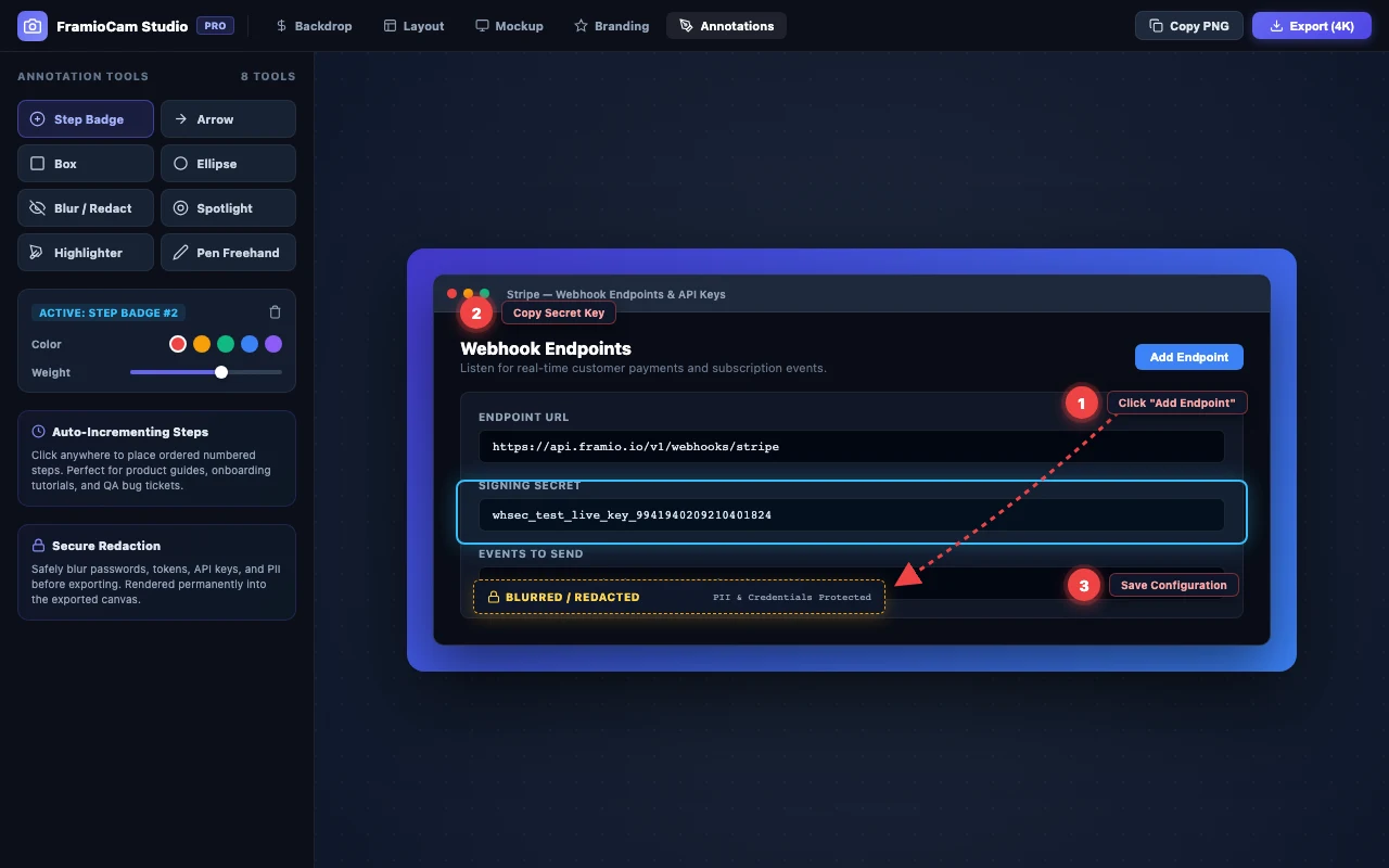
An announcement usually needs one focal point and little or no annotation. An instructional image can use numbered steps, arrows, highlights or a spotlight, but each mark should answer a question the screenshot cannot answer alone.
For a sequence:
- Number actions in the order they are performed, not in the order that fills the canvas neatly.
- Use one annotation colour throughout.
- Keep arrows short and point them at the control, not approximately toward its panel.
- Write labels outside the product UI where possible so nobody mistakes them for controls.
- Export and read the result at its real display size. An annotation that only works when enlarged does not work.
FramioCam’s screenshot editor includes step numbers, text, blur, pen, highlight, shapes, arrows and a magnifying spotlight. The editor keeps those marks separate from the source capture, so they can be moved or removed without taking the screenshot again.
Four recipes that stay out of the way
A landing-page feature image
Use a 16:9 canvas, medium even padding, a quiet gradient taken from the page’s palette, and either a thin outline frame or no frame. Keep the screenshot face-on. Crop until the feature being described is readable without opening the image.
A release announcement
Use 1:1 for a feed or 16:9 for a link card. Leave extra space on the side where the post’s own headline will not overlap. Highlight one new control, not the entire release. A small step badge is often enough.
A sales or investor deck
Use the deck’s 16:9 shape and the same backdrop across every slide. Remove address bars unless the URL is part of the point. Test from across the room: if the interface labels vanish, crop tighter rather than adding a larger shadow.
A help-centre image
Use the original aspect ratio where possible, a plain backdrop or none, and numbered annotations. Avoid perspective, glass reflections and deep shadows. The reader is trying to locate a control, not admire a mockup.
Make a set, not five separate designs
Product marketing rarely needs one screenshot. It needs a launch image, three feature crops and a follow-up post that still looks related a week later.
Choose the shared rules before editing the first one: canvas shape, backdrop, padding, frame, shadow, corner radius and watermark placement. Then change only the crop and annotations per image. FramioCam applies styling across the frames in a project and can export the set from the screenshot editor, which removes the most common source of inconsistency: rebuilding the same treatment by eye.
The images are rendered locally. What leaves your browser spells out the two requests that reach FramioCam and what they contain; screenshots are not among them. The paid plans on the pricing page are one-time purchases, while the free plan keeps the editor available with limits on video export rather than screenshot styling.
When a raw screenshot is better
Do not make a mockup by default.
A raw screenshot is better evidence in a bug report. It is usually clearer in technical documentation. It is more credible in a performance comparison, where decoration can look like an attempt to steer attention. And if the product already has a strong visual frame, adding a second one wastes space.
The finished image should make the product easier to understand at the place and size where it will be seen. If the backdrop, shadow or frame becomes the first thing someone notices, remove one thing and look again.
FAQ
What is a screenshot mockup generator? A screenshot mockup generator places a capture on a designed canvas and can add padding, a backdrop, a browser or desktop frame, shadows and annotations. It is useful for turning a raw product screenshot into an image sized for a landing page, slide or social post.
What size should a product screenshot mockup be? Start with the destination: 16:9 for most slides and wide feature images, 1:1 for a square feed post, and 9:16 for vertical stories. More important than the nominal shape is whether the product’s important text remains readable at the final display size.
Should every product screenshot have a browser frame? No. A frame helps when it tells the viewer that the product runs in a browser or when the capture needs a clear edge. Skip it when browser chrome is already visible, when the platform does not matter, or when the extra frame makes the interface too small.
How much padding should a screenshot mockup use? About 6–10% of the shorter canvas edge is a useful first pass. Adjust after viewing the image at its real display size: add room if it feels cramped and reduce it if the interface becomes hard to read.
Can FramioCam style screenshots that were taken somewhere else? Yes. PNG, JPEG, WebP and GIF files can be dropped, pasted or chosen in the screenshot editor and styled like a capture, including the same backdrops, frames, annotations and batch export.